Published on: 2025-06-18

In the world of trading, finding tools that cut through noise and deliver clear signals is invaluable. Renko charts are one such tool that many traders have found effective for simplifying market analysis and improving decision-making.
Unlike traditional price charts, Renko charts focus exclusively on price movement and filter out time, making trends easier to spot and reducing distractions.
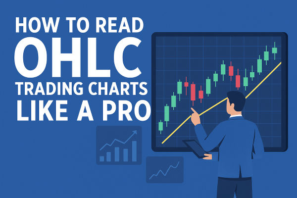
If you are looking for a way to clarify your trading strategy and avoid being overwhelmed by market fluctuations, understanding Renko charts could be a game changer. This article explores what Renko charts are, how they work, their advantages, limitations, and practical tips for using them effectively in your trading.

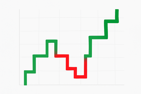
Renko charts originated in Japan and are a type of chart that differs significantly from common candlestick or bar charts. The name "Renko" is derived from the Japanese word "renga," meaning brick, which reflects the chart's distinctive appearance made up of uniform bricks or blocks.
Each brick in a Renko chart represents a fixed price movement rather than a fixed time period. For example, a brick might represent a price move of 10 pips in forex or a set dollar amount in stocks. A new brick is only added when the price moves by this predefined amount, either up or down. If the price fluctuates within the range, no new bricks are formed.
This structure means Renko charts ignore time entirely. Instead of showing how price changes every minute or hour, they show price momentum more clearly by focusing on significant moves. This can reduce noise and help traders see the bigger picture.
Renko charts build bricks at a consistent size. When the price increases by the brick size, a white or green brick is added above the previous one. When the price decreases by the brick size, a black or red brick is added below.
Because bricks only form after a defined price movement, sideways price action results in no new bricks. This filtering effect means that small fluctuations or minor reversals do not clutter the chart, helping traders avoid false signals and indecision.
Traders can set the brick size according to their preferences or trading style. Smaller bricks will create more detailed charts but may include more noise, while larger bricks focus on longer trends but may miss short-term opportunities.
One of the biggest advantages of Renko charts is their ability to filter out market noise. By ignoring time and only focusing on significant price movements, Renko charts offer a clearer view of the trend. This can help traders make more confident entry and exit decisions.
Renko charts also make support and resistance levels easier to identify. Since bricks form only after price moves a fixed amount, these levels tend to appear as clear horizontal lines on the chart. This visual clarity simplifies technical analysis.
Furthermore, Renko charts can be combined with other indicators such as moving averages, RSI or MACD to create robust trading strategies. The simplicity of Renko charts makes it easier to spot trend reversals or continuations, providing timely signals.
Despite their advantages, Renko charts are not perfect. Because they do not take time into account, they can sometimes lag in fast-moving markets. Important price information occurring within the brick size may be overlooked until a new brick forms.
Renko charts can also give fewer signals compared to time-based charts, which might be a drawback for traders who rely on frequent trades or scalping. The choice of brick size is critical; too large and the chart may miss opportunities, too small and it may generate false signals.

To get the most out of Renko charts, it is important to experiment with different brick sizes to find the one that matches your trading style and market volatility. Combining Renko charts with volume indicators or oscillators can improve signal reliability.
It is also wise to use Renko charts in conjunction with traditional time-based charts. While Renko charts simplify trend analysis, time charts provide context on volume and timing which can be crucial for execution.
Above all, always use sound risk management. Like any trading tool, Renko charts do not guarantee profits. They are best used as part of a comprehensive strategy that includes stop losses and position sizing.
Renko charts offer traders a unique way to filter market noise and focus on meaningful price movements. By simplifying the visual representation of trends, these charts can help traders make clearer and more confident decisions. While not without limitations, when used correctly and alongside other tools, Renko charts can significantly enhance your trading strategy.
If you have found traditional charts too noisy or confusing, it may be worth exploring Renko charts as a practical addition to your trading toolkit.
Disclaimer: This material is for general information purposes only and is not intended as (and should not be considered to be) financial, investment or other advice on which reliance should be placed. No opinion given in the material constitutes a recommendation by EBC or the author that any particular investment, security, transaction or investment strategy is suitable for any specific person.
World's Best Broker