Published on: 2025-07-15

Every financial chart tells a story. Behind the lines, bars, or candles, there is a pattern of price action that reflects the psychology of buyers and sellers in real time. Chart patterns are visual signals that traders study to help anticipate where prices might go next. Recognising these patterns is a key part of technical analysis, especially for those who aim to enter or exit trades based on price behaviour rather than fundamental data.
Among the many formations that appear in markets, a few chart patterns emerge so frequently that they have become almost universal in trading education and analysis. These are not just theoretical shapes — they form as a result of real-world forces like consolidation, breakout pressure, trend fatigue and market uncertainty.
In this article, we will explore four of the most common chart patterns that traders encounter across equities, commodities and indices. Understanding these chart patterns does not guarantee success, but it can help traders improve timing, manage risk and develop more structured entry and exit rules.

One of the most recognisable chart patterns in trading is the head and shoulders formation. This pattern signals a potential reversal and typically appears after a strong uptrend. It is made up of three peaks. The first peak, or the left shoulder, forms as buyers push the price up and then pause. The second and highest peak is the head, where price reaches a new high but then retreats. The third peak, or right shoulder, is a lower high, indicating weakening momentum.
The neckline — a horizontal or slightly sloped support line — is drawn by connecting the lows between the shoulders and the head. When the price breaks below this neckline, it is seen as confirmation that the trend has shifted from bullish to bearish.
What makes this one of the most important chart patterns is its psychological clarity. Each failed attempt to reach new highs signals that the bulls are losing strength, and when sellers finally push below the neckline, it often triggers a cascade of exits from long positions.
The inverse head and shoulders, which forms after a downtrend, works similarly in reverse and suggests a potential bullish reversal.

These chart patterns are simple but powerful reversal signals that occur after a sustained trend. A double top forms when price reaches a resistance level twice and fails to break through, creating two prominent peaks at roughly the same level. The neckline, drawn at the low point between the two peaks, acts as a critical support line. When price falls below this line, it often indicates a move lower, as buying pressure fades.
A double bottom pattern forms after a downtrend, showing two failed attempts to push the price lower. It is a sign that sellers are losing strength and that buyers are beginning to step in. The breakout above the neckline confirms the reversal.
These chart patterns are frequently used by traders to set measured targets and place stop losses. They are particularly helpful for identifying turning points after sharp moves in either direction.

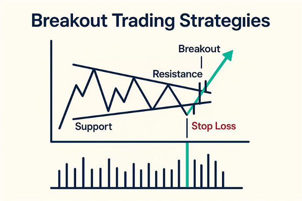
Triangles are chart patterns that indicate consolidation ahead of a breakout. There are three main types: ascending, descending and symmetrical triangles. Each of them forms when the price begins to trade within a narrowing range, creating a triangle shape on the chart.
An ascending triangle shows higher lows pushing up against a flat resistance level. This often signals bullish intent, as buyers are willing to pay higher prices. A breakout above the resistance line is typically seen as a buying opportunity.
A descending triangle forms when the price posts lower highs but finds support at the same level. This shows a build-up of selling pressure and usually leads to a downward breakout.
A symmetrical triangle has both lower highs and higher lows, signalling indecision. When price eventually breaks out in either direction, the move can be swift, as traders who were waiting for confirmation rush to act.
Triangle chart patterns are considered continuation patterns, meaning they often resolve in the direction of the existing trend, but not always. This is why traders wait for a confirmed breakout with volume before entering positions.

Flag and pennant chart patterns are short-term continuation patterns that appear after a strong price move, also known as the flagpole. The flag appears as a small rectangle sloping against the prevailing trend, while the pennant is a small symmetrical triangle that forms after a steep rally or decline.
What makes these chart patterns useful is their indication of a brief pause or consolidation before the trend resumes. Traders view the breakout from a flag or pennant as confirmation that momentum is returning. The size of the prior move can often be used to estimate the potential target once the pattern breaks.
These patterns are most effective in fast-moving markets and are typically used by short-term traders who want to capture the next leg of a move. While they appear frequently, not every flag or pennant resolves in the expected direction, so confirmation through volume and timing is essential.
In a world filled with algorithms and machine learning models, some traders may dismiss traditional chart patterns as outdated. However, chart patterns continue to form because market psychology remains largely unchanged. Fear, greed, hesitation and momentum are human behaviours that continue to drive price action, and chart patterns reflect that behaviour in a visual format.
Experienced traders often combine chart patterns with other tools such as moving averages, volume indicators or trendlines to strengthen their analysis. What matters most is not simply spotting a pattern, but understanding the context in which it appears and using it as part of a broader decision-making framework.
New traders are advised to practise identifying chart patterns in historical data and demo environments before relying on them in live markets. Patterns do not work in isolation, and risk management is essential regardless of how strong a pattern may appear.
Disclaimer: This material is for general information purposes only and is not intended as (and should not be considered to be) financial, investment or other advice on which reliance should be placed. No opinion given in the material constitutes a recommendation by EBC or the author that any particular investment, security, transaction or investment strategy is suitable for any specific person.